Features Comparison
A heading and a table to compare product/service features.
View a live demo of this section.
Modules:
Usage Guide
The Features Comparison section provides a clean, structured way to showcase how your products or services stack up against competitors or different pricing tiers. This section works particularly well on product pages, pricing pages, or dedicated comparison landing pages where prospects need to evaluate multiple options side-by-side.
When you add this section to any page using the Spark Premium theme’s drag-and-drop editor, you’ll get a pre-configured layout that combines an introductory text area with a professional comparison table. The Theme Rich Text module at the top lets you provide context for your comparison—explain what’s being compared, highlight key differentiators, or guide visitors on how to interpret the table below.
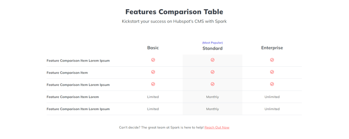
The Feature Comparison Table module is where the real decision-making happens. You can customize column headers for different products, service tiers, or competitor offerings, then add rows for each feature you want to compare. Use checkmarks, X marks, or custom text to indicate what’s included in each option. The table automatically maintains responsive formatting, so your comparisons remain readable on mobile devices.
Pro tip: Keep your feature descriptions concise but specific. Instead of generic terms like “Support,” use “24/7 Phone & Email Support” to provide clear value differentiation. You can also use the rich text area above the table to call attention to your most compelling advantages before visitors dive into the detailed comparison.
This section is particularly effective when placed after a hero section but before testimonials or pricing details, creating a logical flow that educates prospects before asking them to take action.