Form
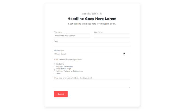
A form section with 900px max width.
View a live demo of this section.
Modules:
Usage Guide
The Form section provides a clean, centered layout for displaying HubSpot forms with optimal readability and conversion focus. With its 900px maximum width constraint, this section ensures your forms remain visually balanced and easy to complete across all device sizes, preventing the awkward stretching that can occur with full-width form layouts.
When to use this section: Choose the Form section for lead generation pages, contact pages, or any standalone form that needs to be the primary focus of your page content. The constrained width creates a more intimate, focused user experience compared to full-width alternatives, which can feel overwhelming on larger screens.
In the HubSpot page editor, you can drag and drop this section anywhere on your page and customize the Theme Form module within it to connect to your specific HubSpot forms. The section works particularly well when placed after hero sections or content blocks that introduce the form’s purpose, as the centered layout naturally draws the user’s attention downward.
Customization options: Beyond selecting your HubSpot form, you can adjust spacing, background colors, and styling through the theme settings panel. Consider adding complementary sections above or below, such as text blocks explaining the form’s value proposition or social proof elements to increase conversion rates.
This section performs exceptionally well on landing pages, thank you pages, and dedicated contact pages where the form is the primary call-to-action. The responsive design ensures optimal display on mobile devices while maintaining the professional appearance that makes Spark Premium forms stand out from standard HubSpot form implementations.