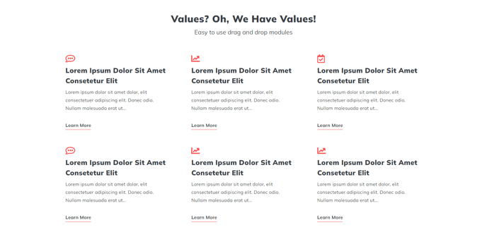
Icons with Text - 6 Items
A heading and set of six Icon with Text items.
View a live demo of this section.
Modules:
Usage Guide
This section combines a prominent heading with six icon-based content blocks arranged in a grid layout, making it perfect for highlighting key features, services, or benefits on your HubSpot pages. The six-item configuration works particularly well on service pages, about pages, and landing pages where you need to communicate multiple value propositions without overwhelming visitors.
When you add this section through the page editor’s drag-and-drop interface, you’ll notice it provides more visual balance than the three-item version while remaining scannable. The Theme Rich Text module at the top lets you craft compelling section headlines and introductory copy, while each Icons with Text module below can showcase individual points with custom icons and descriptions.
Best practices for this section:
- Keep your icon choices consistent in style and weight for professional appearance
- Write concise, benefit-focused copy for each text block to maintain readability
- Use the six slots strategically—consider grouping related concepts or following a logical flow
- On mobile devices, these items stack vertically, so ensure your content makes sense in that order
This section excels when you need more detail than a simple three-item layout but want to avoid the potential overwhelm of larger grids. It’s particularly effective for showcasing service categories, team member highlights, or step-by-step processes. You can customize colors, spacing, and typography through the theme settings to match your brand, and each icon can link to relevant pages for deeper engagement.
Consider pairing this section with simpler content blocks above or below to create visual rhythm on longer pages.