Icons with Text - Left Heading - Boxed In
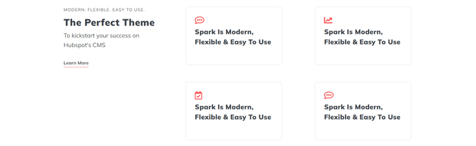
Set of boxed in Icon with Text items and left side heading.
View a live demo of this section.
Modules:
Usage Guide
This section provides an effective layout for showcasing key features, services, or benefits with strong visual impact. The Icons with Text - Left Heading - Boxed In section combines a prominent left-aligned heading with multiple icon-text pairs arranged in bordered containers, making it ideal for service overviews, feature highlights, or process explanations.
You can add this section to any page in your HubSpot site using the page editor’s drag-and-drop interface. Simply navigate to the sections panel and locate this pre-built option under the Spark Premium sections library. The boxed design creates clear visual separation between different items, helping visitors quickly scan and understand your content.
Best practices for implementation:
- Use 3-6 icon items for optimal visual balance and readability
- Choose icons that clearly represent each concept or service
- Keep text descriptions concise but descriptive enough to provide value
- Leverage the left heading space for a compelling section title that introduces the icon grouping
This section works particularly well on service pages, about pages, or homepage sections where you need to communicate multiple related concepts. The boxed styling adds professionalism and structure compared to the standard icons with text layouts, making it suitable for B2B websites or premium service offerings.
The Theme Rich Text module powering the left heading gives you full formatting control, allowing you to add emphasis, adjust sizing, or include brief introductory copy. The modular design means you can easily customize colors, spacing, and typography through your theme settings to match your brand guidelines while maintaining the section’s structured appearance.