Image and Text - Image Right
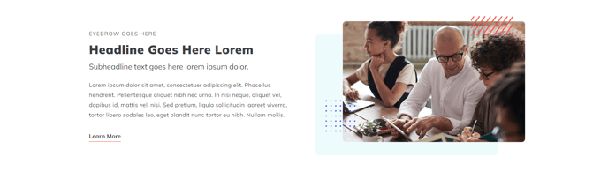
Two column section with image on the right, text on the left.
View a live demo of this section.
Modules:
- Theme Rich Text
- HubSpot Linked Image
Usage Guide
This section creates a balanced two-column layout that’s particularly effective for product showcases, feature highlights, and service descriptions. The Image and Text - Image Right section positions visual content on the right side, which follows natural reading patterns and draws attention to your image after visitors read your text content.
When adding this section through HubSpot’s page editor, you’ll find it works exceptionally well on service pages, product detail pages, and about us sections where you want to pair descriptive content with supporting visuals. The left-aligned text column gives you ample space for detailed explanations, bullet points, or calls-to-action using the Theme Rich Text module.
Best practices for this section:
- Use high-quality images with a 16:9 or 4:3 aspect ratio for optimal display across devices
- Keep your text content concise but informative - the two-column layout works best when neither side overwhelms the other
- Take advantage of the HubSpot Linked Image module to make your images clickable, directing visitors to product pages or additional resources
- Consider alternating between image-left and image-right sections on longer pages to create visual rhythm
The section automatically adapts to mobile devices by stacking the content vertically, with the image appearing below the text on smaller screens. You can customize spacing, background colors, and text alignment through the theme settings panel in HubSpot’s design manager.
This section pairs well with other Spark Premium sections like testimonials or feature grids when building comprehensive landing pages. The consistent styling ensures seamless integration with your overall page design while maintaining the professional appearance that makes Spark Premium effective for business websites.