Tab Images
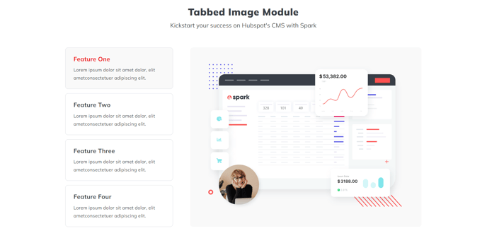
A heading and a tabber of images.
View a live demo of this section.
Modules:
Usage Guide
The Tab Images section creates an interactive visual experience that’s perfect for showcasing multiple product views, before/after comparisons, or step-by-step processes. This section combines a heading area with a tabbed image gallery, allowing visitors to click through different images without leaving the page.
You’ll find this section works particularly well on product pages, service descriptions, and case studies where you need to present multiple related visuals in an organized way. The tabbed interface keeps your page clean while maximizing the visual content you can display in a compact space.
Setting up your content is straightforward in the HubSpot page editor. The Theme Rich Text module at the top lets you add your main heading and any supporting text to introduce the image gallery. Below that, the Tab Images module handles all the interactive functionality - you can upload multiple images and assign descriptive labels to each tab.
Best practices for this section include using images with consistent dimensions to prevent layout shifts when users switch between tabs. Aim for 3-5 images maximum to avoid overwhelming visitors with too many choices. Make sure your tab labels are concise but descriptive enough that users understand what they’ll see before clicking.
This section performs exceptionally well on landing pages where you want to highlight different product features or service benefits without creating a lengthy scrolling experience. The interactive nature encourages engagement while keeping users focused on your key visual content.
Consider placing this section after your main value proposition but before detailed specifications or testimonials to maintain a logical content flow that guides visitors deeper into your page.