Two Tone
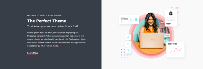
Two columns of differing background colors with text in left column and image in right column.
View a live demo of this section.
Modules
Usage Guide
The Two Tone section creates a striking visual contrast by dividing your page content into two distinct columns with different background colors. This asymmetrical design approach helps break up long pages and draws attention to key messaging through its bold color differentiation.
When you add this section through HubSpot’s page editor, you’ll find it particularly effective for service highlights, product features, or company value propositions where you want to emphasize specific content. The text-left, image-right layout follows natural reading patterns while the contrasting backgrounds create visual hierarchy that guides users through your content.
You can customize both background colors through the theme settings panel to match your brand palette. Consider using your primary brand color for the text column and a complementary neutral or accent color for the image column. The section works exceptionally well when the text background is darker with light text, creating high contrast against a lighter image background.
Best practices for content placement: Use the text column for headlines, descriptive copy, and call-to-action buttons, while the image column should feature high-quality visuals that support your message. This section performs particularly well on service pages, about pages, and landing pages where you need to communicate key differentiators.
The Two Tone section integrates seamlessly with other Spark Premium sections, making it ideal for creating dynamic page layouts. When building longer pages, alternate this section with full-width sections or other two-column layouts to maintain visual interest. The contrasting backgrounds help segment information naturally, improving readability and user engagement across desktop and mobile devices.