Button
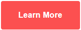
A customizable button.
View a live demo of this module.
Content
- Choose CTA color from button colors set in Theme Settings (Primary, Secondary, Link)
Styles
- Change text alignment
- Edit module spacing
Usage Guide
The Button module is one of the most essential elements in your Spark theme toolkit, designed to drive user actions and conversions throughout your HubSpot site. This module creates standalone call-to-action buttons that you can place anywhere on your pages to guide visitors toward desired actions like downloads, contact forms, or product pages.
When to use this module: Add Button modules to landing pages when you need prominent calls-to-action that aren’t part of other content blocks. They work particularly well in hero sections, between content blocks to break up text, or at the end of blog posts to encourage next steps. Unlike buttons embedded within other modules, this standalone version gives you complete control over placement and spacing.
Page editor workflow: Drag the Button module from your module library into any flexible column or section on your page. The module automatically inherits your theme’s button styling, but you can customize the appearance through the module settings panel. Link your button to any URL, HubSpot landing page, or file using HubSpot’s built-in link picker.
Design consistency: The color options pull directly from your theme settings, ensuring your buttons maintain brand consistency across all pages. When you update button colors in Theme Settings, all Button modules using those color schemes will automatically reflect the changes.
Best practices: Use Primary button colors for your most important actions, Secondary for supporting actions, and Link style for less prominent calls-to-action. Adjust the text alignment based on your page layout—center alignment works well for hero sections, while left alignment typically fits better within content flows. Take advantage of the module spacing controls to create proper visual hierarchy between your button and surrounding content.