Theme Form
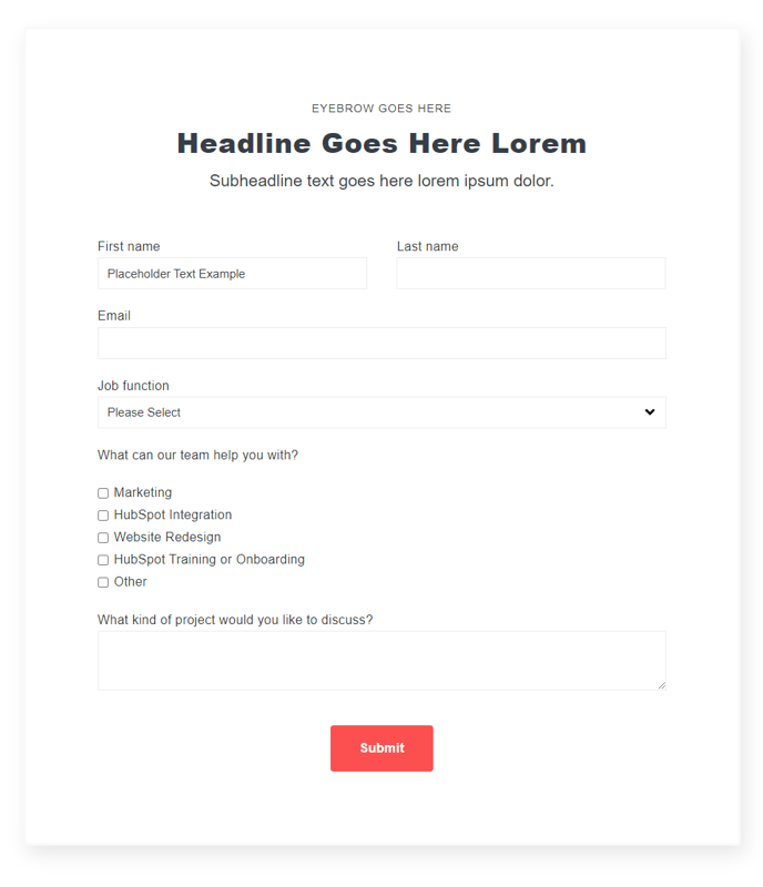
A form module with extra options that are not available in HubSpot's default module.
View a live demo of this module.
Content
- Include a heading
- Change heading alignment
- Choose to box in the form
- Choose label position (left, top, inset)
- Choose button position (left, center, right, full width)
Styles
- Set Dark Mode
- Edit padding
Note: Edit these following styles from your Theme Settings under the Forms section.
- Customize fonts for title, field labels, input text, help text, placeholder, and error text
- Change the field height
- Edit field and error background colors
- Edit field borders
- Edit boxed-in styling include background, border, and box shadow
- Edit dark mode colors
How to Use This Module
The Theme Form module serves as an enhanced alternative to HubSpot’s standard form module, giving you greater control over form presentation and user experience on your Spark theme pages. This module is particularly valuable when you need forms that match your brand’s specific design requirements or when the default HubSpot form styling doesn’t align with your page layout.
When designing landing pages or contact sections, this module excels at creating forms that feel integrated into your overall page design rather than appearing as obvious third-party elements. The boxed-in styling option is especially effective for creating distinct call-to-action sections, while the various label positions help you optimize form layouts for different screen sizes and content flows.
You can drag this module onto any page type within your HubSpot page editor, but it performs particularly well on landing pages, contact pages, and resource gated content pages where form conversion is critical. The inset label option works exceptionally well for modern, clean designs, while left-aligned labels are ideal when you need to accommodate longer field names or multiple language versions.
To maximize effectiveness, configure the global form styling in your Theme Settings first, then use the individual module options to fine-tune specific forms. The dark mode functionality automatically adapts your forms to different page sections, ensuring consistent readability across your site’s color schemes.
Pro tip: Use the full-width button option sparingly—it works best on mobile layouts or when the form is the primary page element. For most use cases, center or left-aligned buttons provide better visual hierarchy and don’t overwhelm your form’s other elements.