Call to Action Box
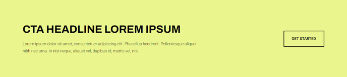
A styled box that includes call to action text and a button.
View a live demo of this module.
Content
- Include eyebrow, heading, sub-heading, and/or text
- Include up to 2 buttons
- Change position of the buttons (left, right, bottom, bottom full width)
Styles
- Set to Dark Mode
- Change the background, border, radius, and padding
- Change the text alignment on both desktop and mobile
How to Use This Module
The Call to Action Box module serves as a conversion-focused element designed to capture visitor attention and drive specific actions on your HubSpot pages. This versatile module works exceptionally well on landing pages, product pages, and service pages where you need to highlight key offers, promotions, or next steps for your visitors.
When building pages in the HubSpot page editor, you can drag this module into any flexible column or section. The module’s strength lies in its hierarchical content structure — the eyebrow text creates urgency or context, while the heading delivers your primary message, and the sub-heading provides supporting details. This layered approach helps guide readers naturally toward your call-to-action buttons.
Strategic placement recommendations include positioning the module after product descriptions to encourage purchases, within service pages to prompt consultations, or on blog posts to drive newsletter signups. The dual-button functionality allows you to offer both primary and secondary actions, such as “Buy Now” and “Learn More” buttons side by side.
The responsive text alignment controls ensure your message displays optimally across devices. While centered alignment works well for promotional content, left alignment often performs better for longer explanatory text. The Dark Mode option helps the module stand out against light backgrounds, while the customizable padding and border radius let you match your brand’s visual style.
For maximum effectiveness, keep your heading under 10 words and ensure your button text uses action-oriented language. The bottom full-width button position works particularly well for mobile users, as it creates a prominent touch target that’s easy to tap.