Collapsible Text
List of collapsible items to condense content.
View a live demo of this module.
Content
- Include a heading with eyebrow, heading, sub-heading, and/or text
- Add as many collapsible items as needed
- Change heading placement (above items, left of items, right of items)
- Set number of items to list per row
- Change spacing between columns
Styles
- Set Dark Mode
- Change text alignment of heading
- Set a max width on the heading
- Change styling of lists
- Change space between list items
- Change bullet type
- Change bullet color (not applicable to image bullets)
- Enclose bullet (if using icon or image can enclose it in a colored box)
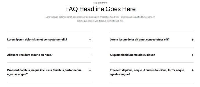
How to Use the Collapsible Text Module
The Collapsible Text module is designed to help you present large amounts of information in an organized, space-efficient format on your HubSpot pages. This module excels at creating FAQ sections, product feature lists, service descriptions, and any content where you need to provide detailed information without overwhelming visitors with a wall of text.
You can drag and drop this module onto any page type in your HubSpot page editor, making it particularly valuable for landing pages, service pages, and product detail pages where space optimization is crucial. The collapsible functionality allows visitors to expand only the content sections that interest them, improving user experience and keeping your pages scannable.
Best practices for implementation: When adding collapsible items, write clear, descriptive headings that give visitors a strong indication of what they’ll find when they expand each section. This helps with both user experience and SEO, as search engines can still crawl the content within collapsed sections.
The flexible layout options make this module adaptable to your page’s design needs. For narrow content areas, position the heading above the items and use a single-column layout. On wider pages, you can display multiple items per row and position headings to the left or right for a more dynamic visual flow.
Pro tip: Use the Dark Mode toggle strategically to create visual contrast on pages with mixed content types. The bullet customization options let you align the module’s appearance with your brand guidelines—consider using custom icons as bullets for branded FAQ sections or service lists.
This module integrates seamlessly with Traverse’s responsive design system, automatically adjusting layouts for mobile devices while maintaining the collapsible functionality that keeps mobile pages clean and navigable.