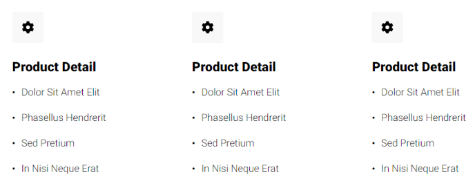
Feature Items
A set of items, such as benefits, services, etc., that can include an icon, text, and/or button.
View a live demo of this module.
Content
- Include a heading with eyebrow, heading, sub-heading, and/or text
- Add as many items as needed with icon (FontAwesome or custom image), title, text, and/or button
- Chang number of columns per row
- Change spacing between rows and columns
- Change heading placement (above items, left of items, right of items)
- Change icon placement (above text, right of text, left of text, inline with title)
Styles
- Set Dark Mode
- Change text alignment of heading
- Set a max width on the heading
- Change text align of feature items
- Style border, border radius, background color, and spacing of feature items
- Change height and color (only applicable to FontAwesome icons) of icons
- Enclose icons in a colored box (style height, width, radius, border, and background color of enclosing box)
- Change styling of lists
- Change space between list items
- Change bullet type
- Change bullet color (not applicable to image bullets)
- Enclose bullet (if using icon or image can enclose it in a colored box)
How to Use This Module
The Feature Items module is perfect for highlighting key benefits, services, or product features in an organized, scannable format. You’ll find this module particularly effective on homepage hero sections, service pages, product landing pages, and about us pages where you need to communicate multiple value propositions clearly.
When building your page in the HubSpot page editor, drag the Feature Items module into any flexible column or section. The module’s strength lies in its adaptive layout system – you can display features in a single column for mobile-friendly stacks, or spread them across multiple columns for desktop showcase layouts. This makes it ideal for responsive design without requiring additional modules.
Pro tip: Use the heading placement options strategically. Position headings to the left of items when you have substantial introductory content, or place them above items for traditional section layouts. The right-side placement works exceptionally well for alternating content patterns throughout your page.
The icon functionality goes beyond basic graphics. When using FontAwesome icons, you can match them perfectly to your brand colors through the theme settings. For custom brand icons, upload your own images to maintain visual consistency across your site. The icon enclosure feature creates professional-looking badges that draw attention to each feature item.
Consider using this module’s list styling options when presenting feature details with multiple bullet points. The custom bullet controls let you maintain brand consistency even in detailed feature breakdowns.
For optimal performance, limit feature items to 6-8 per module instance. If you need more features, use multiple Feature Items modules with different headings to create logical groupings that improve user comprehension and page scanning behavior.