Full Width Two Columns
Two-column module meant to span the entire width of a section that includes text and an image with the left or right placement.
Note: The section this module is added to should have its Content Alignment set to Full width.
View a live demo of this module.
Content
- Include eyebrow, heading, sub-heading, text, and/or buttons
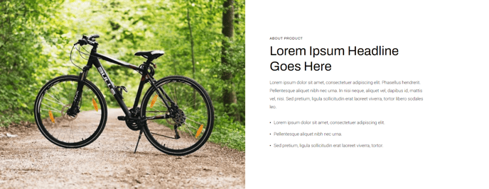
- Include an image
- Change vertical alignment of columns (top, middle, bottom)
- Change placement of columns (image to left of text, image to right of text)
- Change placement of columns on mobile (image above text, image below text)
Styles
- Set Dark Mode
- Change background color
- Change text alignment
- Change styling of lists
- Change space between list items
- Change bullet type
- Change bullet color (not applicable to image bullets)
- Enclose bullet (if using icon or image can enclose it in a colored box)
- Change padding of module
How to Use This Module
The Full Width Two Columns module is ideal for creating impactful hero sections, product showcases, or feature highlights that need maximum visual presence on your pages. Unlike standard content modules that work within container constraints, this module leverages the full browser width to create immersive layouts that grab visitor attention.
When to use this module: Consider adding it to your homepage, product pages, or landing pages when you need to showcase key information alongside compelling imagery. The full-width design makes it particularly effective for above-the-fold content where first impressions matter most.
Setup requirements: Before dragging this module into your page, ensure your section’s Content Alignment is set to “Full width” in the section settings. Without this configuration, the module won’t achieve its intended visual impact and may appear constrained within standard content boundaries.
Content strategy tips: The eyebrow text field works exceptionally well for product categories, company announcements, or attention-grabbing phrases. Your heading should be your primary message, while the sub-heading can provide supporting context or value propositions. The button functionality supports multiple call-to-action scenarios, making it versatile for both informational and conversion-focused pages.
Mobile optimization: Pay special attention to the mobile column placement options in the module settings. Since mobile users scroll vertically, you can control whether your image appears above or below your text content. Generally, place images below text for informational content, but above text when the image is crucial for context or appeal.
The Dark Mode toggle helps this module adapt to various page designs and brand aesthetics within your Traverse theme implementation.