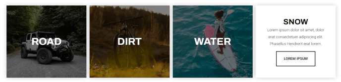
Product Navigation Grid
A grid of navigational items with options for an image, text, or button.
View a live demo of this module.
Content
- Add navigational items with thumbnail image, title, heading, text, and button
- Change how many items to show per row
- Change spacing between rows and columns
- Change the max height of the items on mobile
Styles
- Have module overlap the section above or below it
- Add a load in animation to the navigational items (fade in, up, right, down ,or left)
- Set dark mode on the front tile (text that shows when not hovering on item)
- Change overlay color of the front tile
- Set dark mode on the back tile (text that shows on hover)
- Change text alignment of back tile
- Change background color of back tile
Usage Guide
The Product Navigation Grid module serves as an interactive showcase for your product categories, service offerings, or key site sections. This module works particularly well on homepage layouts, product category pages, and service overview pages where you need to guide visitors toward specific areas of your site.
When adding this module to your pages through HubSpot’s drag-and-drop page editor, consider placement above the fold for maximum impact. The grid’s hover animations create an engaging user experience that encourages exploration, making it ideal for e-commerce sites or service-based businesses looking to highlight their offerings.
Best practices for content setup: Keep your navigation titles concise and action-oriented. Use high-quality thumbnail images that maintain consistency in style and dimensions across all grid items. The button text should clearly indicate what users will find when they click through to each section.
The module’s responsive design automatically adjusts based on your row settings, but pay special attention to the mobile max height option. This ensures your grid items display properly on smaller screens without creating awkward spacing or cut-off content.
Strategic placement tips: Position this module after an introductory hero section or value proposition module to naturally guide users deeper into your site. On product category pages, use it to showcase subcategories or featured products. The overlap styling options allow you to create seamless visual flow between sections, particularly effective when transitioning from image-heavy hero sections.
The dark mode toggle for front and back tiles ensures your navigation grid maintains readability regardless of your chosen background images or brand colors, making it adaptable to various design schemes within your HubSpot pages.