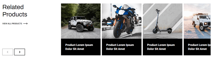
Products Slider
A slider of products and descriptions with optional filter.
Note: The section this module is added to should have its Content Alignment set to Full width.
View a live demo of this module.
Content
- Include a heading with eyebrow, heading, sub-heading, text, and/or buttons
- Add a filter
- Add any number of products that include a category (if adding a filter), image, heading, text, and/or button
- Change spacing between slides
- Change number of sliders to show at a time on desktop, laptop, tablet, and mobile
- Change heading placement (remove, left of slider, right of slider, above slider)
- Edit filter label and placeholder
- Include aria labels on slider arrows for screen reader accessibility
Styles
- Set Dark Mode of heading/slider and slides separately
- Change text alignment of heading
- Change text alignment of heading on mobile
- Set a max width on the heading
- Change background color of slides
- Truncate the title to limit it to a certain number of characters before hovering, allowing for a more consistent look across cards with varying title lengths
- Set a minimum height on the title for a more consistent look across cards with varying title lengths
- Truncate description to limit the description to a certain number of characters so it doesn’t overflow the card
- Change aspect ratio of images
- Set object fit of images (cover crops the image to fit the aspect ratio, contain resizes the image to fit inside the aspect ratio)
- Add a load in animation to the slides (fade in, up, right, down, or left)
How to Use This Module
The Products Slider module is designed to showcase multiple products in an engaging, interactive carousel format that’s perfect for e-commerce sites, product catalogs, and service showcases. This module works exceptionally well on homepage hero sections, product category pages, and dedicated landing pages where you want to highlight featured offerings without overwhelming visitors with too many options at once.
When adding this module through the HubSpot page editor’s drag-and-drop interface, you’ll want to place it in a section configured for full-width content alignment to ensure the slider displays properly across all screen sizes. The module’s responsive design automatically adjusts the number of visible slides based on device type, giving you precise control over the mobile and desktop experience.
The optional filtering functionality makes this module particularly powerful for sites with diverse product lines. Content editors can assign categories to each product, then enable the filter dropdown to let visitors narrow down results. This feature transforms a simple slider into an interactive product discovery tool, reducing bounce rates and improving user engagement.
For optimal performance, consider limiting your product count to 8-12 items per slider to maintain fast loading times. The module’s truncation settings help maintain visual consistency when product titles and descriptions vary in length—especially important for maintaining a professional appearance across different product categories.
The load-in animations add polish to your site’s user experience, but use them sparingly. The subtle “fade in” or “up” animations work best for professional sites, while the directional animations can add personality to more creative or lifestyle-focused brands. Always preview your slider on mobile devices through HubSpot’s preview mode to ensure the spacing and animation effects enhance rather than hinder the mobile browsing experience.