Tabbed Content
Tabular content that can contain rows and columns of text, image, video, form, or an icon list.
View a live demo of this module.
Content
- Include a heading with eyebrow, heading, sub-heading, and/or text
- Choose orientation of the tab navigation (vertical or horizontal)
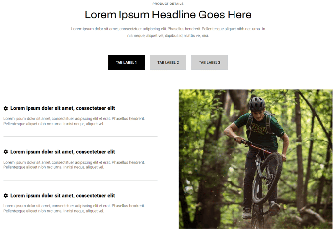
- Set tab label
- Add however many rows is needed
- Set vertical alignment of columns in the row (top, middle, bottom)
- Set a max width on the row
- Add however many columns are needed and set their width (Note: The combined percentage of all column widths in the row must not exceed 100%)
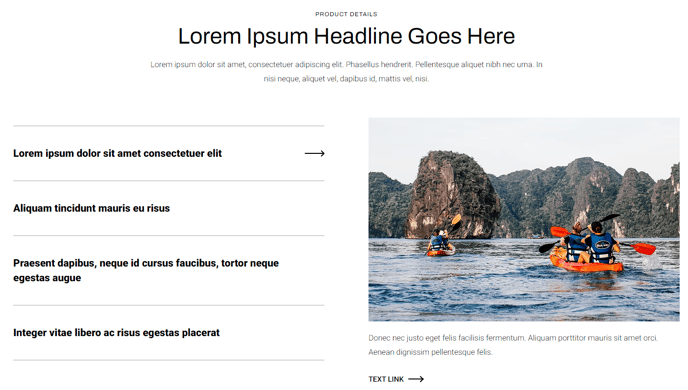
- Choose column type (text, icon list, image, video, or form)
- In a text column, include eyebrow, heading, sub-heading, text, and buttons
- In an icon list column, add however many list items is needed with optional icon (FontAwesome or custom), title, and text
- In a video column, include a preview thumbnail, video, and description
- In a form column, include a heading (eyebrow, heading, sub-heading, text) and form
Styles
- Set Dark Mode
- Change heading text alignment
- Set a max width on the heading
- For icon list columns, change the icon height and color (color is only applicable to FontAwesome icons)
- For forms:
- Set Dark Mode
- Change heading text alignment
- Box in the forms (edit background, border, box-shadow, and padding)
- Change label position (left, top, inset)
- Change button position (left, center, right, full width, single field)
- Change button color
How to Use This Module
The Tabbed Content module is designed to organize complex information into digestible sections, making it perfect for product feature comparisons, FAQ sections, or service breakdowns on your HubSpot pages. This module works particularly well on landing pages, service pages, and product detail pages where you need to present multiple categories of information without overwhelming visitors.
When adding this module through the HubSpot page editor’s drag-and-drop interface, you’ll find it excels at replacing long-scrolling content with an interactive tabbed experience. The flexible column system within each tab allows you to create rich layouts that combine text explanations with supporting visuals, embedded forms, or detailed feature lists using the icon list option.
Best practices for content editors: Start by planning your tab structure before building—consider grouping related information logically and keeping tab labels concise (2-3 words maximum). The vertical tab orientation works exceptionally well for mobile responsiveness and when you have longer tab labels, while horizontal tabs create a cleaner look for desktop-focused pages with shorter labels.
Take advantage of the mixed column types within tabs to create engaging content hierarchies. For instance, combine a text column explaining a service with an adjacent form column for lead capture, or pair product descriptions with video demonstrations. The max-width settings at both the heading and row levels help maintain optimal reading experiences across different screen sizes.
The Dark Mode styling option integrates seamlessly with the Traverse theme’s global styling system, automatically adjusting contrast and colors to match your brand guidelines set in the theme settings. This ensures consistency across your entire HubSpot site while giving you granular control over this module’s appearance.