Text and Image Columns
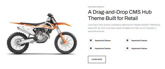
Quickly create two columns with text and an image.
View a live demo of this module.
Content
- Include image on one side
- Include eyebrow, heading, sub-heading, text, and buttons on the opposite side
- Change vertical alignment of columns (top, middle, bottom)
- Change placement of columns (image to left of text, image to right of text)
- Change mobile placement of columns (image above text, image below text)
Styles
- Set Dark Mode
- Add a load in animation to the image (fade in, up, right, down, or left)
- Change text alignment
- Make lists appear in two columns
- Change styling of lists
- Change space between list items
- Change bullet type
- Change bullet color (not applicable to image bullets)
Usage Guide
The Text and Image Columns module is one of the most versatile content blocks in the Traverse theme, designed to break up long-form content and create visually engaging sections throughout your site. You’ll find this module particularly effective on homepage hero sections, product feature pages, about us pages, and service landing pages where you need to communicate key messages alongside supporting imagery.
When adding this module through the HubSpot page editor’s drag-and-drop interface, consider your content hierarchy carefully. The eyebrow text works well for category labels or call-outs, while the heading should capture your primary message. The sub-heading provides additional context without overwhelming the main headline, and the body text area supports rich formatting including the specialized two-column list feature.
Image selection and optimization play a crucial role in this module’s effectiveness. Choose high-quality images that complement rather than compete with your text content. The module automatically handles responsive sizing, but uploading images at least 800px wide ensures crisp display across all devices. Take advantage of the load-in animations to create dynamic page experiences, especially when stacking multiple Text and Image Columns modules on longer pages.
For maximum visual impact, alternate the image placement between left and right positions when using multiple instances of this module on the same page. This creates a natural reading flow and prevents your layout from feeling repetitive. The mobile placement controls are particularly important for user experience—experiment with both above and below text positions to see which works better for your specific content and imagery combination.