Theme Form
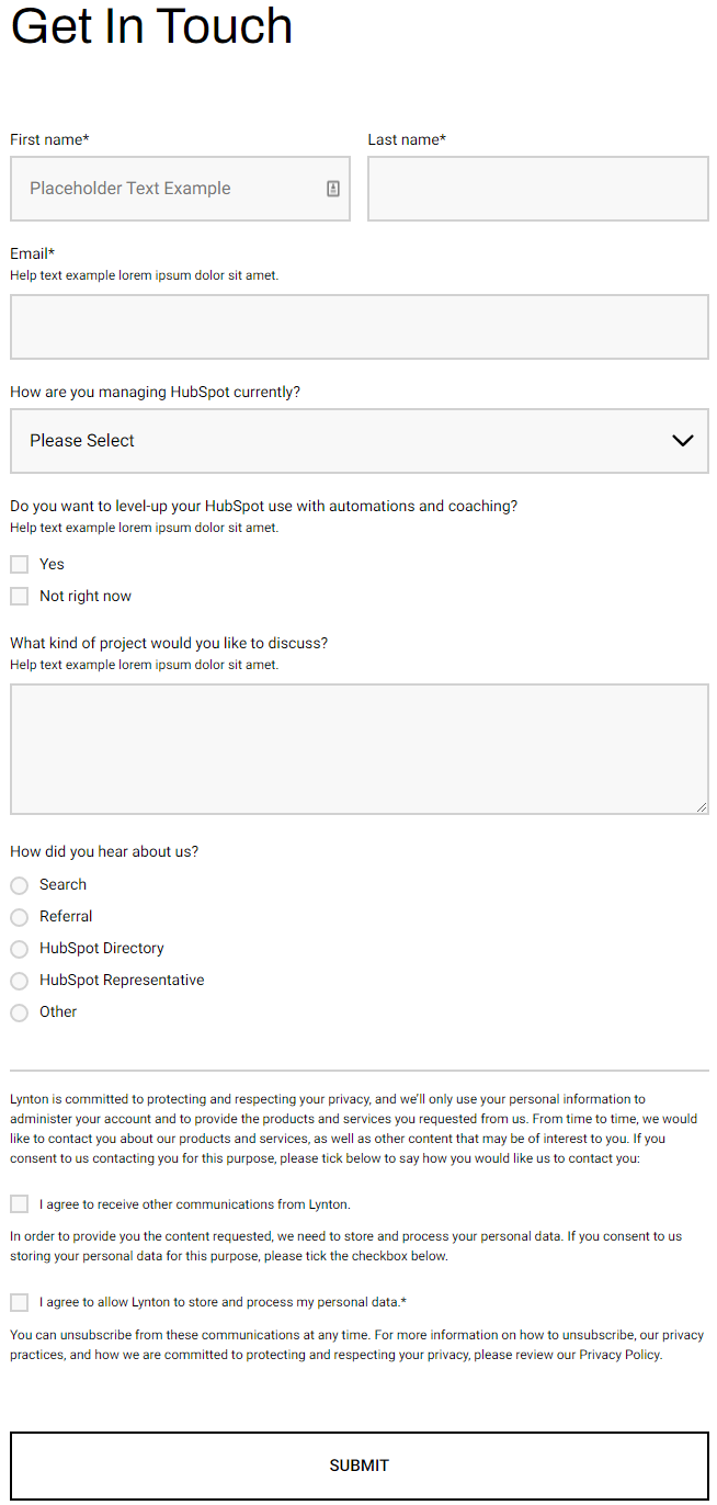
A form module with extra options not available in HubSpot's default module.
View a live demo of this module.
Content
- Include heading (with eyebrow, heading, subheading, and/or text)
Styles
- Set Dark Mode
- Set a max width on the module
- Set the horizontal and vertical alignment of the module
- Have module overlap the section above or below it
- Change heading alignment
- Change heading position (left of form, right of form, above form)
- Set a max width on the heading
- Box in the form (edit background, border, box-shadow, and padding)
- Change labels position (left, top, inset)
- Change button position (left, center, right, full width, single field) and color
Usage Guide
The Theme Form module serves as a powerful replacement for HubSpot’s standard form module when you need enhanced styling control and layout flexibility. This module is particularly valuable for landing pages, contact pages, and lead generation sections where form presentation directly impacts conversion rates.
When to Choose This Module
Use the Theme Form module instead of the default HubSpot form when you need precise visual control over your form’s appearance. It’s especially effective on homepage hero sections, dedicated contact pages, and product inquiry pages where the form needs to complement complex layouts or branded design elements. The module excels in scenarios where you want your form to feel integrated with surrounding content rather than appearing as a separate component.
Setup and Configuration
After dragging the module into your page editor, start by selecting your HubSpot form from the Content tab. The heading options work particularly well for providing context—use the eyebrow text for category labels like “Contact Sales” or “Get Started,” while the main heading clearly states the form’s purpose.
The heading position controls are crucial for responsive design. Position headings to the left or right of forms on desktop layouts, but always preview mobile breakpoints since these will typically stack vertically. When boxing your form with background colors or shadows, ensure sufficient padding to maintain readability across devices.
Pro Tips
The overlap feature creates engaging layered designs when used with background sections. Set conservative max-widths (around 600px) for better mobile experience, and use inset labels for modern, space-efficient forms. The single field button positioning works excellently for newsletter signups and simple lead capture forms.