Theme Rich Text
A rich text module with extra styling options not available in HubSpot's default module.
View a live demo on this module.
Content
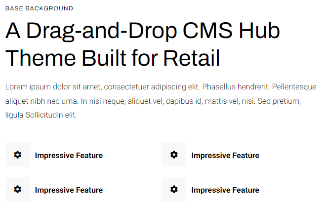
- Include eyebrow, heading, sub-heading, text, and buttons
Styles
-
Set to Dark Mode
-
Change alignment of text
-
Change max width of module
-
Make lists appear in two columns
-
Change styling of lists
- Change space between list items
- Change bullet type
- Change bullet color (not applicable to image bullets)
-
- Enclose bullet (if using icon or image can enclose it in a colored box)
How to Use This Module
The Theme Rich Text module serves as an enhanced replacement for HubSpot’s standard rich text module, giving you significantly more control over typography and visual presentation. You’ll find this module particularly valuable when creating content-heavy pages like service descriptions, about pages, or detailed product information where standard formatting options feel limiting.
To add this module to any page, simply drag it from the module library in the HubSpot page editor onto your desired location. Unlike the default rich text module, this component provides dedicated fields for structured content hierarchy—you can add an eyebrow (small text above the main heading), primary heading, sub-heading, body text, and call-to-action buttons all within a single, cohesive module.
When building content, take advantage of the advanced list styling options to create more engaging presentations of features, benefits, or step-by-step processes. The two-column list layout works exceptionally well for breaking up long lists of features or specifications, making your content more scannable for visitors. You can customize bullet styles with icons, images, or colored shapes to match your brand aesthetic.
The Dark Mode toggle is particularly useful when placing this module over background images or colored sections where standard text might not provide sufficient contrast. The alignment and max-width controls help you maintain consistent spacing and readability across different screen sizes, ensuring your content looks polished whether visitors view it on desktop or mobile devices.
Consider using multiple instances of this module on longer pages to break up content sections while maintaining visual consistency throughout your site’s design system.