Two Tone Section - Image Right
Two tone section module with an image set to the right of the text.
View a live demo of this section.
Modules
Usage Guide
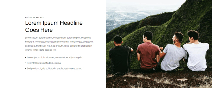
The Two Tone Section - Image Right creates a visually engaging layout that splits your content area into two contrasting background colors, with your image positioned on the right side of the text content. This asymmetrical design works particularly well for product introductions, service explanations, or feature highlights where you want to break up monotonous page layouts.
When editing this section in the HubSpot page editor, you’ll work with the Full Width Two Columns module that powers the layout. The left column typically features a darker or colored background for your text content, while the right column showcases your image against a contrasting tone. This creates natural visual separation that guides readers through your content in a logical flow.
Choose this section when you want to emphasize textual content first, as the left-aligned text naturally draws attention before the supporting image. This makes it ideal for landing pages where you’re explaining complex products or services that require more descriptive copy.
To optimize the visual impact, ensure your images have sufficient contrast against the background tone you’ve selected in the theme settings. The Traverse theme’s responsive design automatically stacks these elements on mobile devices, so test how your content hierarchy works on smaller screens.
For e-commerce applications, this section excels at showcasing product benefits alongside lifestyle images. The two-tone background prevents the layout from feeling flat while maintaining professional presentation standards. Consider alternating between Image Right and Image Left sections throughout longer pages to create dynamic rhythm that keeps visitors engaged as they scroll through your product showcase or service offerings.