Text and Image Columns
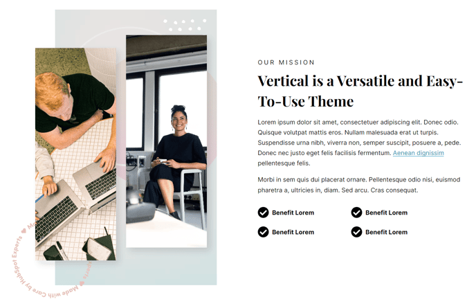
Module used to create two columns with text and an image.
View a live demo of this module.
Content
- Change vertical alignment
- Change image placement on both desktop (right or left) and mobile (bottom or top)
Styles
- Add animation to image
- Set Dark Mode
- Change text alignment
- Customize list styling
How to Use This Module
The Text and Image Columns module is one of the most versatile components in the Vertical theme, perfect for creating engaging content layouts that balance written information with compelling visuals. You can drag this module into any page template within HubSpot’s page editor to build professional-looking sections that work seamlessly across all device types.
This module excels on service pages, about us sections, feature explanations, and product showcases where you need to pair descriptive text with supporting imagery. The two-column structure creates visual hierarchy while maintaining readability, making it ideal for breaking up long-form content or highlighting key value propositions.
When configuring the module, you’ll find the content settings allow you to fine-tune how your text and image interact visually. The vertical alignment options ensure your content looks balanced regardless of text length, while the flexible image placement controls give you complete design freedom. On desktop, you can position images on either side to create visual flow throughout your page, and the separate mobile controls ensure optimal mobile experience by letting you stack content logically.
The styling options integrate seamlessly with the Vertical theme’s design system. Dark mode compatibility means your content will automatically adapt to your site’s theme settings, while the animation options add subtle engagement without overwhelming your message. The text alignment and list styling controls ensure consistency with your brand guidelines and the overall theme aesthetic.
For best results, use high-quality images that complement rather than compete with your text content. This module works particularly well when alternating image placement across multiple instances, creating a dynamic zigzag layout that guides visitors down your page naturally.