Feature Grid
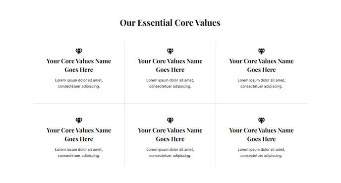
A grid of featured items.
View a live demo of this section.
Modules:
How to Use This Section
The Feature Grid section provides a visually striking way to showcase multiple features, services, or benefits in a structured grid layout. This section works exceptionally well for SaaS companies looking to highlight product capabilities, technology firms displaying service offerings, or any business that needs to present multiple items with equal visual weight.
When you add this section to your page through HubSpot’s page editor, you’ll find it pairs perfectly with hero sections and call-to-action blocks. The grid automatically adjusts from multiple columns on desktop to a single column on mobile devices, ensuring your content remains readable across all screen sizes.
Best practices for the Feature Grid section:
Use consistent content lengths across all grid items to maintain visual balance. If one feature has a lengthy description, aim for similar word counts in the others to prevent awkward spacing.
This section performs best on homepage, product, and service pages where you need to communicate multiple value propositions quickly. Consider placing it after your main hero section but before detailed product information or testimonials.
In the page editor, you can easily reorder grid items by dragging and dropping within the Feature Grid module. This flexibility allows you to prioritize your most important features in the top-left position, which naturally draws the eye first.
The Vertical theme’s Feature Grid section includes built-in spacing and typography that aligns with the overall design system. You won’t need to adjust padding or margins manually – the section automatically maintains proper visual hierarchy with your other page elements.
For optimal performance, limit your grid to 6-9 items maximum. Beyond this number, consider splitting content across multiple sections or pages to avoid overwhelming visitors with too many choices at once.