Featured Items - Three
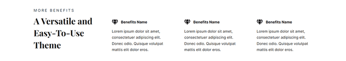
A list of three items with an icon, heading, text, and call to action.
View a live demo of this section.
Modules:
How to Use This Section
The Featured Items - Three section provides an ideal layout for showcasing key product features, service highlights, or company benefits in a scannable, three-column format. This section works particularly well on your homepage, product pages, or service landing pages where you need to communicate multiple value propositions without overwhelming visitors.
When you add this section to any page through the HubSpot page editor, you’ll find it automatically inherits the Feature Items module, which gives you complete control over each column’s content. You can customize the icons by uploading your own graphics or selecting from HubSpot’s icon library to match your brand aesthetic. The heading and text fields support rich text formatting, allowing you to emphasize key points with bold text or add subtle styling that aligns with your messaging hierarchy.
Pro tip: This section performs exceptionally well above the fold on landing pages, as the three-item limit prevents cognitive overload while the call-to-action buttons create clear next steps for visitors. Consider using contrasting button colors that complement your theme’s color palette, which you can adjust in the theme settings.
The responsive design automatically stacks the three columns on mobile devices, ensuring your content remains readable across all screen sizes. For optimal visual balance, keep your headings concise (under 8 words) and your descriptive text between 20-40 words per item.
This section pairs effectively with the Vertical theme’s other content blocks – consider placing it after a hero section to immediately reinforce your main value proposition, or use it before testimonials to build credibility through feature-benefit storytelling.