Two Column - Image Right
Two columns with text on the left and an image on the right.
View a live demo of this section.
Modules:
How to Use This Section
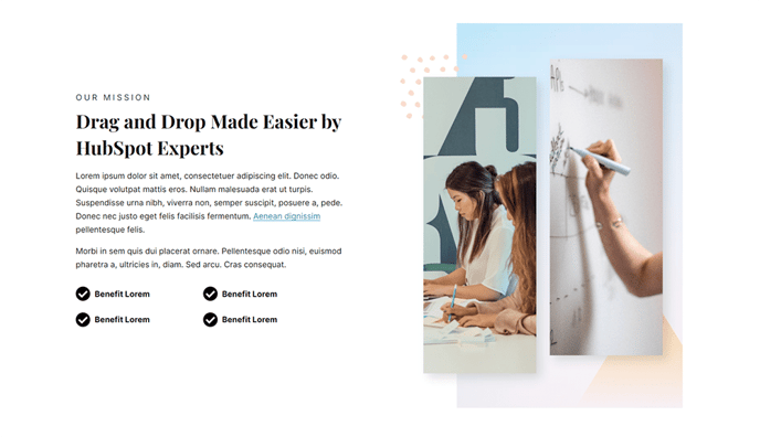
The Two Column - Image Right section creates a balanced visual hierarchy that naturally guides visitors’ eyes from your content to supporting imagery. This layout works exceptionally well for product announcements, feature explanations, and company introductions where you want text to be the primary focus while maintaining strong visual appeal.
When adding this section through the HubSpot page editor’s drag-and-drop interface, you’ll find it particularly effective on landing pages, product pages, and about pages. The left-aligned text column provides ample space for detailed descriptions, benefits lists, or calls-to-action, while the right-positioned image reinforces your message without overwhelming the content.
Content Strategy Tips:
- Use high-quality product screenshots, team photos, or conceptual graphics in the image area
- Keep your text concise but comprehensive — the two-column format works best with 2-4 paragraphs
- Include a strong headline and supporting button in the text column to drive conversions
The underlying Text and Image Columns module offers extensive customization through the Vertical theme’s design system. You can adjust spacing, typography, and alignment directly in the page editor without touching code. The responsive design automatically stacks the columns on mobile devices, ensuring your image appears below the text for optimal mobile reading flow.
This section pairs exceptionally well with the Vertical theme’s other content blocks — consider alternating between image-left and image-right sections to create visual rhythm throughout longer pages. The consistent styling maintains your brand coherence while preventing monotonous layouts that can reduce visitor engagement.