Call to Action Cards [+ only]
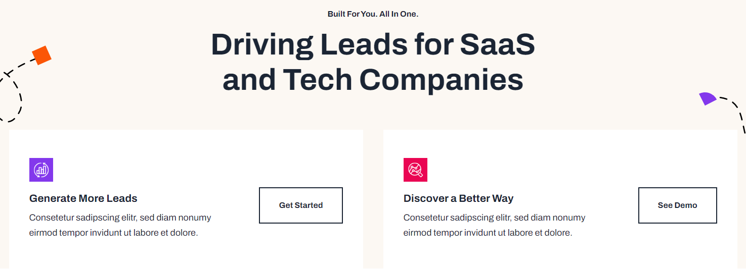
A set of cards with icon, text, and call to action.
Note: This module is only available in Framework+, a paid version of Framework.
View a live demo of this module.
Content
- Include a heading
- Add any number of cards with icon, title, text, and call to action
- Make entire card clickable to call to action link
- Set number of cards to include in a row
Styles
- Set dark mode on heading and cards separately
- Change text alignment and max width of heading
- Change heading level of heading in the cards
- Set a load in and hover animation on cards
- Change background color, border, and box shadow of cards
- Change text alignment of cards
- Change call to action position of cards (left, right, bottom left, bottom center, bottom right)
How to Use This Module
The Call to Action Cards module is designed to showcase multiple service offerings, product features, or conversion opportunities in an organized grid layout. This module works exceptionally well on homepage hero sections, service overview pages, and dedicated landing pages where you need to present multiple pathways for user engagement.
When building your page in the HubSpot page editor, drag this module from the Framework+ module library into your desired section. The module automatically adapts to your content needs—you can add as few as one card or create extensive grids with multiple rows depending on your messaging strategy.
Content Strategy Tips: Use this module when you have 3-6 related offerings that deserve equal visual weight. For SaaS companies, consider featuring different product tiers, integrations, or use cases. Technology companies often use these cards to highlight different services, solutions, or customer segments they serve.
The clickable card option is particularly powerful for conversion optimization. When enabled, users can click anywhere on the card surface to trigger the call-to-action, significantly increasing the clickable area and improving user experience on mobile devices.
Design Considerations: The module’s flexible styling options allow you to maintain brand consistency while creating visual hierarchy. Use the dark mode toggle strategically—for instance, apply dark mode to cards while keeping the heading in light mode to create contrast. The animation settings help draw attention to your offers, with load-in animations being especially effective above the fold.
For optimal performance, limit yourself to 4 cards per row on desktop layouts. The module automatically handles responsive behavior, ensuring your cards remain readable and actionable across all device types.