We are officially retiring our 20-year old brand and unveiling Lynton’s new look! Change is exciting, but you may be curious why it’s happening here and now. With that in mind, we’d love to share the reason behind our decision with you!
Why the New Name
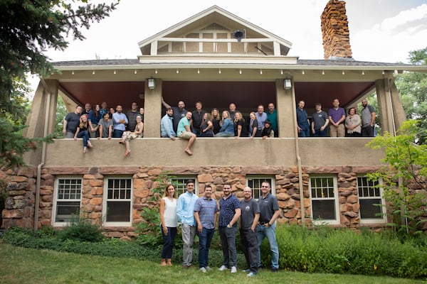
LyntonWeb was founded by Daniel Lynton 21 years ago, with a primary focus on helping businesses create functional websites to grow their digital presence. Our company started working in offices, but when leadership realized we could widen the talent pool by switching to an all-remote environment while boosting productivity, we seized the opportunity.
With more diverse skills and talent available to us, we started offering more services. Over the years, we became more adept in inbound marketing strategy, as well as HubSpot CRM integrations. Additionally, we became a HubSpot partner, quickly rising in the partner-level tiers (eventually reaching Elite partner status). We still offered website designs and developments, but it was obvious we were evolving.
Starting in late 2019, it became clear to our stakeholders that the “Web” in LyntonWeb was limiting. Our rolodex of services is so much more comprehensive than the name suggests, and we needed to capitalize on that. To create clarity about the services we offer, we opted for an overhaul -- one that reflects a more modern, sleek, and expansive agency partner.
Enter: Lynton.
“Undergoing something as complex as rebranding can cause hesitation in even the most confident person. But you don’t get to HubSpot Elite status without taking risks,” said CEO Daniel Lynton. "In our company, we frequently say ‘Courage to Change, Courage to Grow,’ and I believe what we’re doing now showcases that mantra well. We’re elevating our organization so we can continue to provide white-glove service for years to come, while not losing our domain authority and recognition in the HubSpot ecosphere.”
Why the New Logo
Like our company name, our logo was also over 20 years old. Naturally, we wanted to revisit the iconography to see how we could modernize it to match our rebranding efforts. The update is minimalistic, clean, and captivating – and echoes our main three service categories.
“This logo concept originated around pillars, the three services we offer - Integration, Marketing, and Web. The services are represented in the logo mark with slightly different L’s, and together they collectively make the company whole. But it really can mean much more!” said Creative Director Rob Walz. “There is some homage to the old logo with the way the logo is separated, cut, and the overall simplicity of it. But this is really about moving forward and creating our stamp for the future!”
What This Means for You
Innovation is in our DNA, and our rebranding exemplifies that. We hope the new styling demonstrates that we’re not afraid to change, grow, and evolve, to not only remain relevant but on the cutting edge. Even though our name, logo, and website look different, our dedication to superior service will remain the same.
Ready to start a project with the newly-minted Lynton team? Reach out today!