Multnomah Group's Website Design Offers the Ability to Easily Update Content
The Challenge
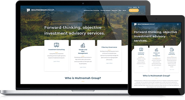
Multnomah Group is a leading, national consulting firm for retirement and investment accounts. However, their old site made them appear as a small, localized operation that lacked thought-leading content. To create a more polished site that allows them to expand on their offerings and draw in leads with actionable offers, Multnomah Group partnered with Lynton. Specific issues Multnomah Group had our team address:
- Clunky navigation bar with too many clicks
- Confusing grid design on the homepage
- Misleading search field at the top of the website
- Lacking social media channel promotion
- Unorganized resource center
The Solution
We approached the website redesign process with our typical strategy but had the advantage of their marketing manager offering great insights. She wanted the site to stay true to its Portland roots but expand the design, so the company seemed more national - because they serve businesses from coast to coast. Lynton provided sitemapping, wireframing, and designing. We created defined templates for specific uses, such as their About Us and service detail pages. After being trained on how to insert content and create templates in HubSpot, the Multnomah Group modified a lot of the material for the site. We provided this training so the team could easily make new templates and make quick changes when needed. With the new site completed, Multnomah Group plans to continue blogging, creating new content for their personal advisory service clients and beefing up their gated content such as whitepapers.
The Results
The new website successfully repositioned Multnomah Group as a national retirement consulting firm with streamlined navigation, professional design elements, and an organized resource center. By empowering their marketing team with HubSpot training and custom templates, they can now independently manage their content strategy and quickly adapt to market needs. The modernized platform better reflects their coast-to-coast service capabilities while maintaining their Portland identity.
Their old site made it feel like they were a small local business even though they served businesses throughout the states. So, we sought to create a site that was modern, clean and that felt more like a national brand. We simplified their navigation from the old, making this site much more user friendly. We also wanted to make sure that they had the capability with this site, to showcase any of new content offerings (eBooks, whitepapers, etc.) they planned on creating.”
Rob Walz
Lynton
Creative Director