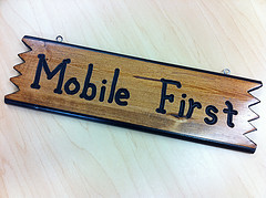
Building a Mobile First Website on the New HubSpot Content Optimization System
When HubSpot let us have a sneak peek at their new Content Optimization System we got so excited about it we decided to immediately move our website, lyntonweb.com, over to this new platform that supported responsive design.
We had also wanted to try a different approach to website strategy and decided to experiment on ourselves by using a mobile first approach - starting with mobile wireframes and planning our content strategy with mobile in mind first.
Much like a desktop website we had to start with answering some basic questions. We needed to make sure we could articulate how our services help as our customers, clearly show what you can do on our website, and give the user a reason why they should care. Once these larger questions were answered, going with this mobile first approach forced us to do a number of things that are also good for the desktop experience:
Be Extremely Concise. On a mobile screen it becomes obvious and painful very quickly when you are using 5 words to say something that only needs one. Example: Our old services pages listed our services and detailed them out in many unnecessary paragraphs. Our new services page focuses on quickly identifying the problems we solve.
Define a Clear Hierarchy of Needs. While the desktop experience is a bit more debatable as how to layout your content, in mobile the most important information goes on top. Example: This was super helpful in focusing our homepage. When a user comes to your site they need to know what you do and how you can help as soon as possible. Our mobile first approach lead us to what we have now, a brief vision statement of how we help followed by a explanation of our services.
Better Navigation. When the navigation is has too many options, mobile is unforgiving. This forces you to simplify your navigation. Example: We cut down on the quantity of pages in our website and used a nice little development trick to make sure the navigation wasn’t the first thing you see when you look at our site on mobile.
Clear Content. When you are on mobile your user is likely doing other things, watching tv, eating, driving (hopefully not!) when they are looking at your website. With this in mind it becomes even more necessary to not use industry jargon or other confusing language. Example: On our previous site were guilty of using both industry jargon and unclear language. One example of this is using the broad term “Technology” to describe our HubSpot integration services. While our integrations are technology this does not give a first time reader a clear idea of our capabilities.
Like any company, we had a lot we wanted to say on our website but had to focus on what the customer wanted to hear. We are pleased with the result of our test run of mobile first and excited to see the results it proves. Sometimes less is more. What do you think of the new site? Do you think mobile first might be a good strategy for your next redesign?