Eight Design Trends for Your Inbound Website
Being halfway through the year, it’s clear what web design trends are dominating 2019. Many of these components carried over from 2018 but have exploded in usage in 2019. The use of any of these trends can help you create a beautifully designed and modern website.
So, if you’re considering redesigning your website soon, or just want to stay on top of what’s new, here are our picks for top design trends for your inbound website.
Depth and Texture Imagery
The influence of virtual reality is almost everywhere – including website design. Plenty of designers are already implementing design elements that have a tactical feel to them. This includes illustrations, either hand-drawn or made in a program like Adobe. Adding a feature like this to your website can instantly grab someone’s attention while helping to portray your brand’s personality.
And this trend often goes above just a simple drawing. Some brands are saying no to the flat design craze of yonder and saying yes to 3-D and animated illustrations. This, along with the use of other textured elements like shadows, helps emphasize points you want to resonate with people. However, using an abundance of texture may turn your website visitors away, so be careful about how many you place on your site.
Organic Shapes
More and more inbound websites are drawing away from overuse of geometric shapes in favor of more natural, fluid ones. While your standard squares, rectangles, and triangles are still prevalent in web design because they provide a sense of structure, organic shapes like curves are becoming more popular because they give depth to a website. They are naturally imperfect, making your site feel more human and relatable.
Increase in Video
While video isn’t necessarily a new trend the increase and variation of it is. Video helps diversify your page by breaking up text copy and appeals to your audience who prefer to watch rather than read.
So, what’s new with video? Some companies have been using full background videos, essentially making their websites motion pictures. Others are user shorter videos more frequently to explain portions of their website. All of this is important to note because Google loves video. The search giant has recently made a move toward mixed search page results, placing video content above standard webpages in results.
Emotional Connections
Getting your website visitor to take action on your website takes a lot of work. In fact, you can argue you need to build a relationship with each online user. That’s why more brands are getting emotional on their websites through design.
But how? Well, all the visual elements on your site exist to provide cues to how your visitors react. Imagine you’re a bicycle shop that wants to sell a parent a bike for their child. You may want to use imagery of parents spending time biking with their kids and closeups of the joy it brings the child.
Another way websites are making emotional connections with people are through micro-interactions. A micro-interaction is a specific response to an action someone takes on your website. They’re surprising, inviting, and human. An excellent example of a micro-interaction are hover-overs. Femme & Fierce, a women’s clothing site, uses this feature in a very unique way. Every time someone hovers over an article of clothing small hearts, kisses, or lollipops dance across the screen.
Bolder Colors
Bright colors are in, and everyone is taking notice, including Pantone. Their 2019 Color of the Year is “Living Coral” a vibrant hue that noticeably stands out. Not only are vivid colors trending, but color transitions and gradients are as well.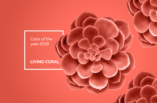
As brands fight for consumers’ attention, it only makes sense these vivid palettes are picking up steam. In such a crowded space, websites need something eye-catching. Thanks to the advancement in technology, these colors look better than ever on desktop and mobile screens.
Monochromatic Typography
Designers are known for bending the rules. After all, how would new trends emerge if they didn’t stray from older ones?
While serifs were traditionally used only in print material, designers have started using them more in website designs. . Serifs were designed to be decorative, making them great for emphasis in headlines and sub-headlines. And thanks to higher definition and higher resolution screens, serifs are more readable on screens now than ever before.
Minimalism
Minimalism is a classic design trend that shows no signs of slowing down. Minimalist website designs have simple frameworks that utilize color and typography for emphasis. Often, designers significantly pare down their color palettes, using one to two hues and typefaces.
The trend will continue to dominate because with fewer elements and content on a site, the less your visitors will have to think about. And as we mentioned, brands are fighting for you to think about them. With a simple design, your visitors can breathe. They also work well in responsive environments and load quickly.
More White Space
The use of white space has been a design tool for decades, but the increasing amount of its use is new.. Adding white space helps contrast your information, giving your visitors a sense of direction and flow. It helps establish focal points and gives your audiences’ eyes a rest. Because of this, more designers may employ it to make a statement.
What Are Some Good Examples?
While it’s smart to acknowledge design trends, it’s even better to see them for yourself. Check out some websites that use a variety of the trends mentioned above.
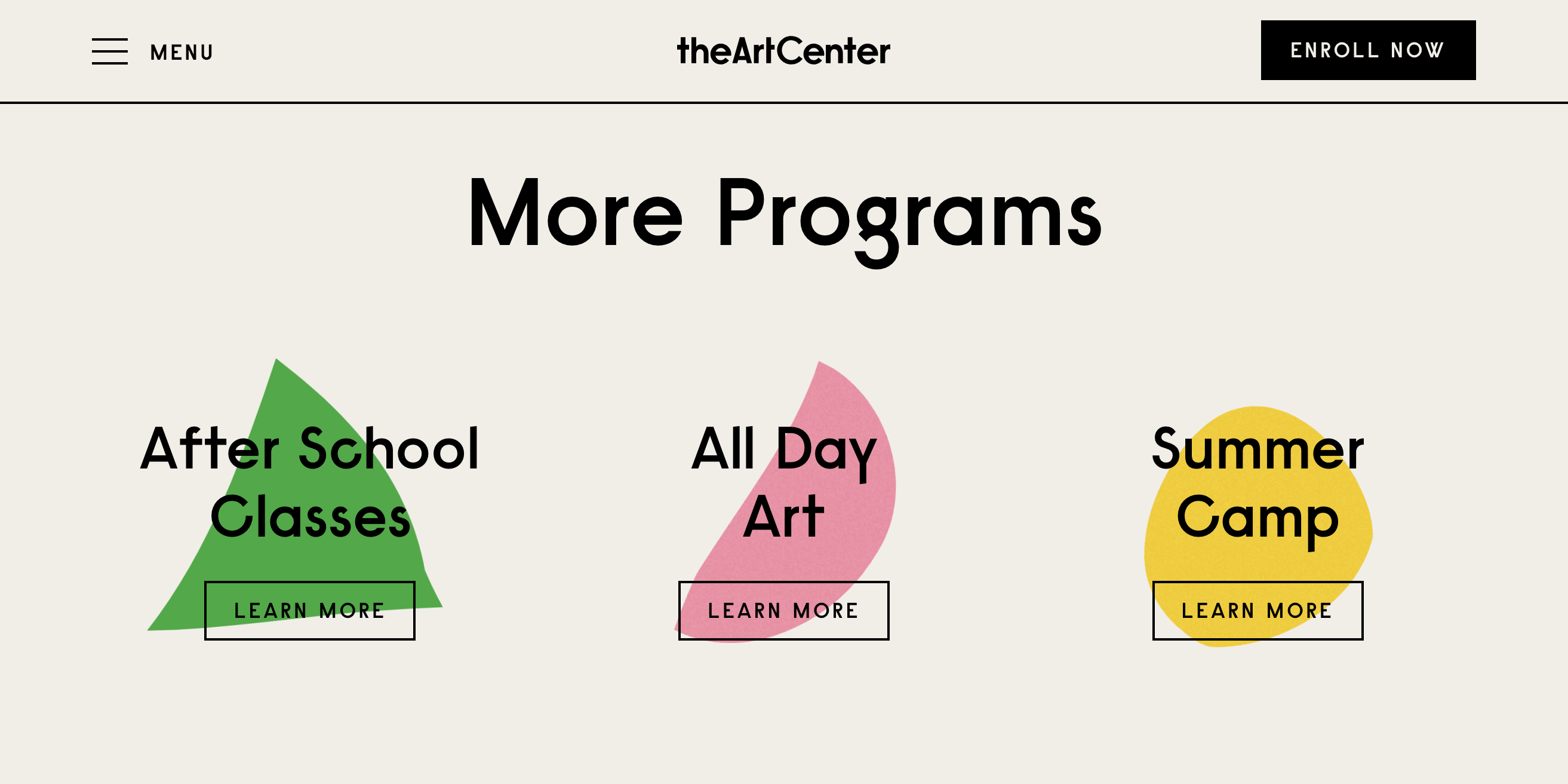
The Art Center – organic shapes, bright colors, animated images, and white space.
Crowd Rise – Vivid colors, texture, illustrations, emotional connection, and white space.
Adoratorio Studio – Minimalism, texture, and monochromatic typography.
Ark Shelter – Video, emotional connection, and whitespace.
How Do I Get a Trendy Website Design?
With so many ideas to pick from, it may be challenging to know what’s best for your brand. Should you use bold colors or employ white space? What about crafting the perfect micro-interaction? Luckily, you don’t have to do it alone. LyntonWeb can help guide you in creating a beautifully designed website – that also drives leads. Contact us today to learn how!