How to Use HubSpot's Drag-and-Drop Editor for Website Pages

Read How We Generated 50,000+ Searches in 30 Days
New to building pages in HubSpot or just haven’t got the hang of HubSpot’s drag-and-drop editor? Like most CMS, there is a bit of a learning curve when finding your way around a page editor. Learning the essential components and functionality of how the editor works will get you far in building pages more efficiently. To help you in that journey, here’s an in-depth guide to the ins and outs of HubSpot’s drag-and-drop page editor.
The HubSpot Design Manager vs. Page Editor
First, to clarify a common point of confusion, let’s go over the difference between a drag-and-droppable template in the Design Manager versus in the Page Editor.
The Design Manager is a development environment located under Marketing > Files and Templates > Design Tools. It contains all the files for templates or modules used across the portal. Before HubSpot added drag-and-drop functionality to the Page Editor, there was a type of template that was drag-and-droppable when developing in the Design Manager. Unlike drag-and-drop templates for the Page Editor, the layouts of these templates were not changeable once creating pages with them. If you’ve been a user in HubSpot for a while and/or have older templates in your portal, you may come across such a template. Although you can still create these templates in the Design Manager, they are not recommended for new content as they do not support many of HubSpot’s recent features.
Templates that are drag-and-droppable in the Page Editor, sometimes called DnD templates, are now the recommended template build. They are fully coded HTML templates using HubL (HubSpot Markup Language) to specify drag-and-drop areas and content. Ultimately, they are meant to allow non-developers to rearrange the layout and content when building pages. This front-end experience is what this guide will be going over.
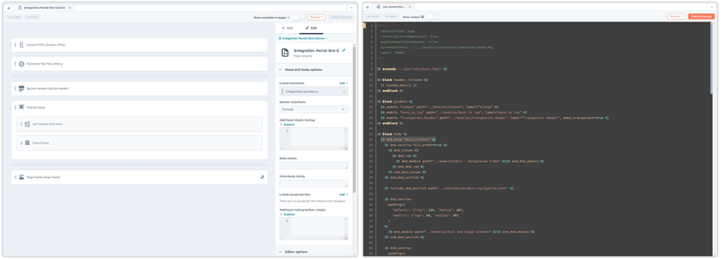 Design Manager drag-and-drop template vs. DnD template built for drag-and-drop in the Page Editor
Overview of the HubSpot Page Editor
When you open the Page Editor for a website page, landing page, or blog listing, you’ll see two panes pertinent to the drag-and-drop experience.
Sidebar
The first is the left-hand sidebar with an Add, Content, and Theme tab. The Add tab is where you’ll find all the modules available in your portal. The Content tab is a simple list of all the content currently on the page. And the Theme tab will link you to the Theme Settings for the template if it’s part of a theme.
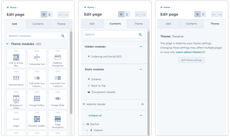
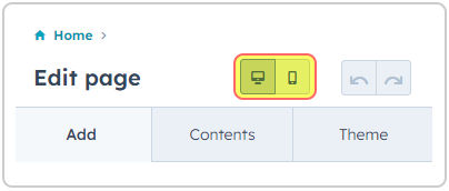
Above these tabs, you’ll see a desktop and mobile icon. Switching between these two lets you edit how content will appear on these separate breakpoints. For example, if there’s a specific module you want to style differently or don’t want to show to mobile users, you can use the mobile breakpoint to do this.
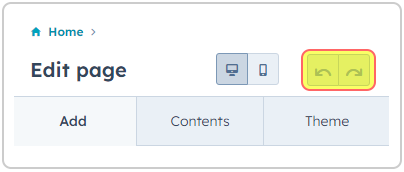
Next to the breakpoint switches is a back and forward button. These are used to undo changes you’ve made to the page one step back and forth at a time.
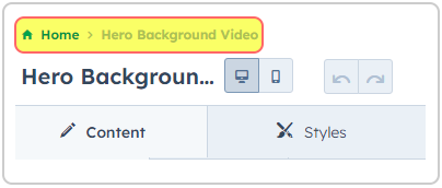
At the very top of the sidebar are the breadcrumbs. When clicking into a section, column, or module, the breadcrumbs will be the quickest way to return to a previous view in the sidebar.
Preview Pane
The preview pane to the right of the sidebar is the main work area where you can drag and drop all your content. This pane shows you exactly how your page will look, for the most part. There may be some inconsistencies with how the content looks in the page editor versus on a live preview wherever JavaScript is involved. The preview pane, and the template in general, comprises sections, columns, and modules.
Related Reading: Getting Started with Your Marketplace Theme
What Are Sections in the HubSpot Drag and Drop Editor?
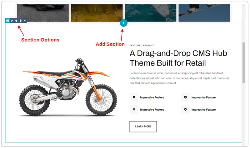
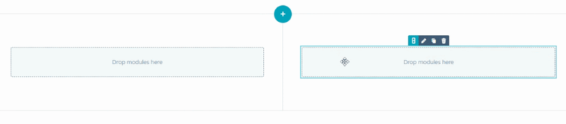
Sections are the top most component of a drag-and-drop area that wraps around a single row of columns.
When you hover over content in the Page Editor, a light blue border will appear around any section you’re currently hovering in. On the top left of that border will be buttons to style, clone, delete, or save the section. A plus button to add a new section will also appear either on the top or bottom of the section, depending on which end your cursor is closer to.
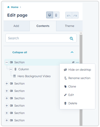 You can navigate to the Contents tab in the left-hand sidebar to get an overview of all the sections on the page. Hovering over a section in the list will give you the same setting options as in the preview pane, with the addition of “Rename Section,” allowing you to name a section to organize the Contents tab better. You can collapse and expand each or all sections to view the columns and modules inside them.
How to Add a Section
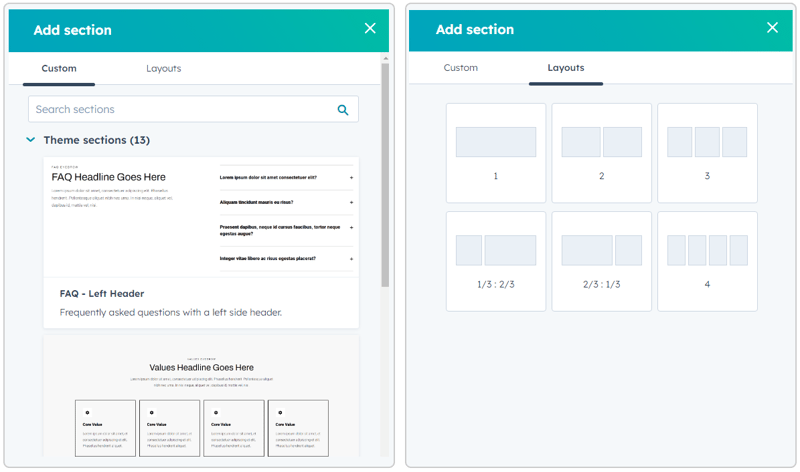
When you click the plus button to add a new section, it’ll open a pop-up sidebar on the right of the screen. If you click the button on the top or bottom of a section, a new section will be added respectively above or below that section.
The “Custom” tab in this sidebar will show saved sections available in the theme and sections you’ve saved yourself. Saved sections are pre-built sections with modules and styling already set in them. You can save a new section to your Saved Sections by clicking the dropdown arrow in the section options and then “Save Section.”
The “Layouts” tab lets you select from predefined column layouts to add a blank section.
How to Style a Section
Clicking the pencil icon in the settings options will open the section styling options in the left-hand sidebar. From here, you can control the breakpoint visibility of the section, alignment, spacing, and background. “Alignment and spacing” allows you to add padding and margin to your section. You can also choose to center the content at a max width or have it span the full width of the page. “Background” allows you to add a color, image, or gradient background to the section.
Related Reading: How to Get Started with HubSpot Drag and Drop Emails
What Are Columns in the HubSpot Drag and Drop Editor?
HubSpot’s drag-and-drop functionality is built on a 12-column grid system, meaning each section can have up to twelve columns, sized at one wide.
Hovering over a column will wrap it in a blue border and show buttons at the top-center to style, clone, or delete a column. However, being between sections and modules, getting the column options to appear instead of the module options can be challenging. With this in mind, using the Contents tab to utilize column options is easier. Styling options available for columns are the same as for sections, minus the width options in “Alignment and spacing.”
If you have multiple columns in a section, hovering over one of the columns will show a thin line between each column. Grabbing that line with your cursor will allow you to drag and change the widths of the columns.
There isn’t a button to directly add a new column, like with sections, but there are a few ways that columns can be created. You can clone a column, drag in a module to the left or right of a column to create a new column next to it or add a new section using the provided columned Layouts.
What Are Modules in the HubSpot Drag and Drop Editor?
Modules are where all your actual content is contained. Hovering over a module will wrap it in a blue border and show options in the top right to edit, clone, or delete the module.
How to Edit a Module
Clicking on the edit button or anywhere within the module will open the module settings in the left-hand sidebar. In a module’s settings, there are two tabs. The Content tab will generally contain options for editing the module’s content; images, text, forms, etc. In comparison, the Styles tab will include options pertaining more to the look and feel of the module, such as colors, borders, fonts, etc.
How to Add a Module
To add a new module, you’ll first need to search for the module you want to use in the Add tab of the left-hand sidebar. You can search for a module in the search bar or browse through the three collapsible lists. The “Theme modules” list are modules explicitly made for the template’s theme. “Common modules” are default modules made by HubSpot available in every portal. “All modules” are all the modules in your portal. Remember that modules in “All modules” may not work as expected in the template since they aren’t all created specifically for that template/theme.
Once you’ve found the module you want, grab it with your cursor, drag it into the preview pane wherever you want to place it and drop it. Dropping a module above or below another module will add it to the same column. Dropping it to the left or right of another module will create a new column. If you drop a module above or below a section, it’ll create a new section with the module in a single full-width column.
Static/Hidden Modules
Some modules in a template may not be clickable or draggable from within the preview pane. These modules cannot be deleted but can be edited from the Contents tab. If they don’t have any visible content (aren’t clickable), they get listed under “Hidden modules.” If they’re not part of a drag-and-drop area, they get listed under “Static modules.” Modules like this would generally be settings that affect the page as a whole or have a particular spot they need to be placed in the code, such as schema or a back-to-top button.
What is HubSpot Global Content?
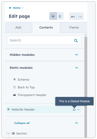 In most DnD templates, you’re likely to come across global content. Global content is content that, when edited, the changes will be applied to it across all templates and pages that that content is in. In particular, the header and footer of a template would normally be global content.
Hovering over global content in the preview pane will highlight it in orange. The Contents tab of the left-hand sidebar will separate them from the rest of the modules with a circular icon to the right of their name. Clicking on a global content area will open a dialog with a button that will redirect you to a separate page editor for editing its content.
What Are The Benefits of HubSpot’s Drag-and-Drop Editor?
Now that you know how to use drag-and-drop functionality in the Page Editor, you can customize pages far more than before without needing a developer. HubSpot’s drag-and-drop allows you to pull in any available modules and build out a page however you need without being limited by static templates.
It also allows you to style components, like sections and columns, with backgrounds and padding to adjust the page to your liking. Drag-and-drop templates give more power to content creators when it comes to page creation and give time back to developers that was before spent on making multiple versions of static templates.
Interested in learning more about HubSpot’s drag-and-drop functionality? Reach out to our team.

Alyssa is a web developer with Lynton, with 10+ years experience coding in HubSpot. Specializing in front-end and email development, Alyssa is also knowledgeable in search engine optimization, accessibility compliance, cross-client compatibility, and various other web technologies.