6 Website Navigation Best Practices
Download Guide to Planning Your Website
What happens when you land on a website that’s hard to navigate? You get frustrated, and you leave. Building a user-friendly navigation system for your website should rank as high as the design priority itself.
Let’s dig into what website navigation is and a few best practices to help you lower your website bounce rate.
What is Website Navigation?
Website navigation is an interface that allows your visitors to find content and other features on your site. These can be links, buttons, CTAs, copy, menus, and more.
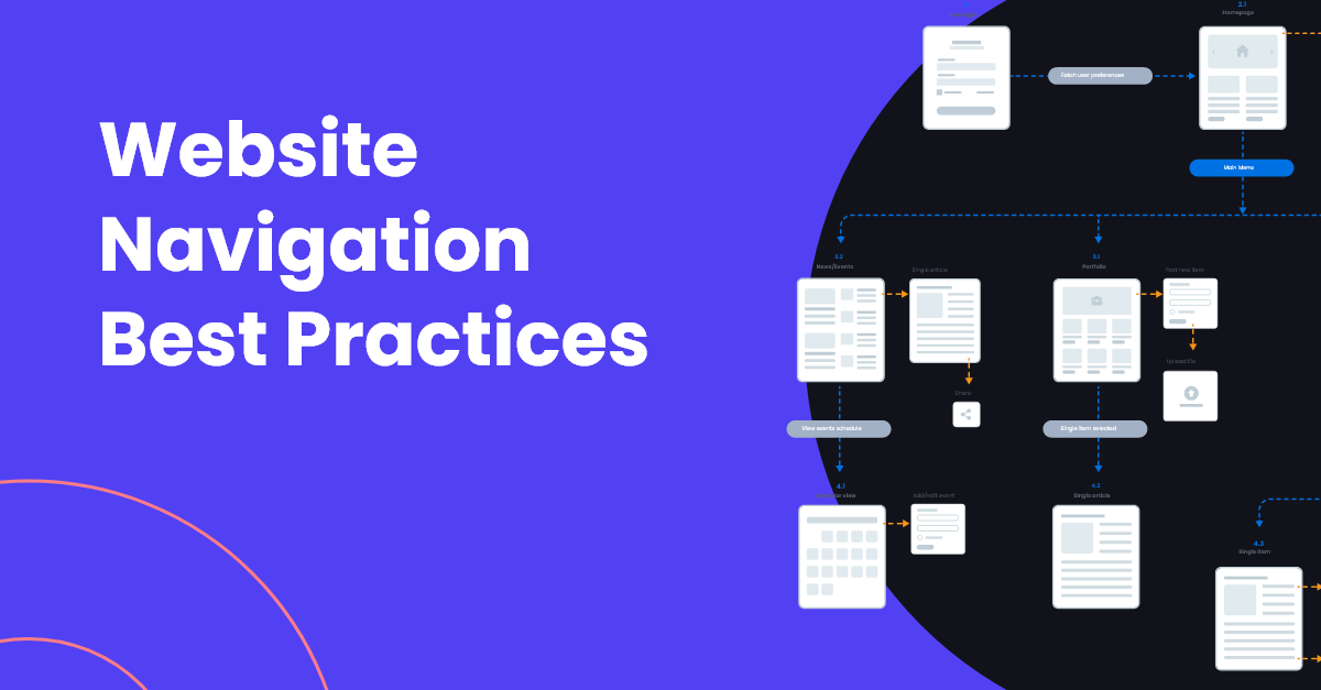
A website navigation menu is an organized list of links to other internal website pages. Think of it as the key to a map that describes what you offer and where to find it within the site. Navigation menus typically run across the top (header) of a webpage, but they can also be found along the left side or in collapsable configurations. Navigation links are also found in website footers.
Is It Time For a Website Overhaul? Get Our Checklist For Help
How to Create Website Navigation
There are two components of building a website that you need to consider before you begin: sitemaps and page hierarchy.
Sitemap
As you begin to build or rebuild a website, it’s important to create a sitemap — a list of all the URLs on your site — that shows how all your pages are connected. A sitemap is valuable in the design process and helpful for Google’s site crawlers.
Page Hierarchy
Now that you have a list of URLs, determine which pages are most important to your brand and offering. Think about SEO and what people are searching to find you, and limit your nav to seven items.
After you’ve determined your seven sections, write the names of other important pages of your website on index cards and invite your team to help you categorize them. HubSpot calls this Card Sorting. This will help you determine the subpages of your website and how they are connected. Not only are you getting input and buy-in from your team, but you’re also stepping into the mind of the user for a flawless UX.
Website Navigation Best Practices
Here are a few other navigation best practices to keep in mind as you build.
Do: Make It Make Sense
It may be tempting to give links trendy or cutesy names, but that is not helpful to someone who is coming to your site for the first time. Make your site navigation clear by using helpful, simple terms.
Read How We helped OceanFirst Bank Simplify Their Navigation & More
Do: Make Your Nav Consistent
Your navigation menu should be in the same places on every webpage. It should also LOOK the same on every page. If a user cannot figure out how to get somewhere once they click on a page, they will get frustrated and leave. If the nav bar has different functionality across pages, that will confuse visitors.
Besides the header and footer nav, you can also consider a sticky nav that scrolls with the user.
Do: Use Breadcrumbs
No matter if you’re scrolling, walking, driving, or something else, we’ve all had a “how did I get here” moment. The same can be true with website navigation. This is where breadcrumb navigation comes in handy.
Breadcrumbs show a user where they are in a website’s structure so they can retrace their steps when they want to backtrack. Breadcrumb nav is small and considered a secondary navigation bar. It’s made up of text links separated by a symbol (> or / or |) and placed below the header.
For example, on Wayfair, the secondary nav for a search for rugs is as follows: Rugs/Popular Rug Sizes/5’x8’ Rugs/ Each tag is hyperlinked so users can click back anytime.
Do: Link Logo to Homepage
Linking your logo to your homepage is a very common expectation on websites. Doing this meets user expectations and gives your visitors a chance to reorient themselves with your site. Sometimes you just want to start over, ya know?
Do: Add Search Bar
Not adding a search functionality is like not adding a gear shift to a car: how do you get anywhere?! Whether someone is coming to your site for the first time or they’re coming back for information, you need to provide a way for them to search for what they need.
When they click into search, make the cursor automatically ready for typing and display results in chronological order with your newest content first.
Do: Make It Responsive
You never know what platform someone will use to get to your site — whether it’s a tablet, phone, laptop, or desktop, your site needs to be responsive to their screen. According to recent data, over 60% of total online purchases are now made with mobile device. Your widescreen desktop nav won’t work on a phone. Opt for nav that users can side-scroll, or change to a hamburger collapsable option.
Hint: If you start by designing your website for mobile first, it’s easier to understand the most crucial parts of your site nav and how you can translate it on a bigger (laptop, desktop) scale.
Download Our Guide to Planning a Website That Works
Making Website Navigation Easy
One rule of thumb for website navigation: Keep it simple. Don’t overthink it. Creating a sitemap and page hierarchy with your team will help you find kinks in the plan, and if you’re still not sure, ask a few brand ambassadors to test!
At Lynton, we have a team of designers ready to assist you in figuring out your next website redesign. Reach out today to see how we can help.