Considering redesigning your website?
Whether you're considering a slight website refresh or a complete overhaul, this blog will equip you with the insights, inspiration, and strategies necessary to successfully navigate the complexities of website redesign.
How to First Approach a Website Redesign
Redesigning a website is a strategic endeavor that requires thoughtful planning and execution. Begin by evaluating your current site's performance and identifying critical areas for improvement. Consider the user experience, design aesthetics, and functionality of your site. Ensure your redesign goals align with your overall business objectives by going through these steps:
- Assessment and Planning: Analyze your existing website to understand what works and what doesn't. Use analytics to identify high-traffic pages, bounce rates, and user engagement patterns. This step should inform your redesign priorities and goals.
- Design and User Experience (UX): Focus on creating a visually appealing design that offers an intuitive and seamless user experience. Consider the latest web design trends but prioritize usability and accessibility.
- Content Strategy: Evaluate your current content and determine what can be repurposed, what needs updated, and what should be created anew. Content should be engaging, relevant, and optimized for search engines.
- Technical Considerations: Decide whether to continue with your current content management system (CMS) or switch to a new one that better fits your needs. HubSpot’s CMS, for example, offers a range of features for inbound marketing and website personalization (more later).
- Website Hosting: Choose a reliable hosting service that ensures your website is fast, secure, and scalable. Your hosting decision can impact your site's performance and user experience.
- SEO and Mobile Optimization: Ensure your redesigned website is optimized for search engines and mobile devices. Mobile responsiveness and SEO are crucial for reaching a wider audience and improving your site's visibility.
- Testing and Launch: Before going live, thoroughly test your website for any issues in navigation, content, and functionality across different devices and browsers. Collect feedback and make necessary adjustments.
- Post-Launch Analysis: After launching, monitor your site's performance closely. Use analytics to track visitor behavior, engagement, and conversion rates. Be prepared to make ongoing adjustments to optimize user experience and achieve your business goals.
Examples of Website Redesign
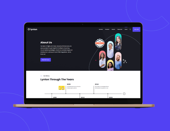
At Lynton, we help countless companies design and redesign their websites, so we'd be remiss if we didn't take the opportunity to show some examples of businesses that went through the process. For these examples, we'll focus on the HubSpot CMS and some of our favorite projects and how HubSpot helped achieve success.
Personalization and Smart Content with Friedrich and Trace One
HubSpot allows you to present customized content to your visitors. For example, we helped Friedrich design their main homepage's call to action to change based on who's visiting. Trace One uses multi-lingual content to provide a personalized experience for users who speak different languages.
Personalized Resources with HubDB at SyncSmart
The little things can make all the difference when engaging with your visitors, leads, and customers. HubSpot's HubDB has options to create resource centers so your website visitors can find the most relevant information. We took advantage of this feature on SyncSmart's website.
Google Maps API and HubDb (Again) for Habitat for Humanity EBSV
The way you list your locations doesn't have to be dull, thanks to HubSpot. A combination of APIs and HubDb allows Habitat for Humanity EBSV to proudly show off where they service communities in a clean, straightforward, yet aesthetically pleasing fashion.
Animated Features and More with Dean & Draper
The Dean and Draper team has gone through several website iterations with our team. The current site features a custom animated header, icons, modules to display services, an in-depth blog with custom search and featured articles, and a fresh design.
Drag-and-Drop Decision Tree for Tusker Livestock
HubSpot's drag-and-drop capabilities simplify user choices as quickly as 1, 2, 3 with this custom module. On the backend, our team set up the first selection of options, moving on to the next until the website visitor reaches the appropriate answer based on their choices. The best part? It's all food for horses, cows, and other livestock!
Custom Objects for PDR by ConnectiveRX
With the help of custom objects, we pulled in all of PDR.net's prescription drug information. Users can enter their prescriptions or browse for the proper medication using easy-to-use search functionality.
Fully Responsive with Custom Modules at EXPLO
EXPLO utilizes CMS Hub for its fully responsive and custom module capabilities, leaving it with a fresh, minimalist look that effectively explains its programs. If you don't have a developer to create custom modules for your site, you can always explore our themes on the HubSpot marketplace.

Streamlined Navigation for Multnomah Group
With Multnomah Group's approval, we designed and developed a stunning website, giving them a simplified navigation and resource center with custom iconography that reflected their local roots. Limit the number of menu items so your visitors have a clear path to follow on your site. Also, be descriptive in your labels!
Website Redesign Frequently Asked Questions
Even with some advice and examples, it's natural to have questions about the process, costs, and outcomes of redesigning your website. Let's dive into some of the most commonly asked questions about it:
- Why Should You Redesign Your Website?
To improve user experience, update the site's look, enhance functionality, and align with current web standards and SEO practices. - How Often Should You Redesign Your Website?
Generally, every 2-3 years to keep up with design trends, technology advancements, and evolving user expectations. - How Much Does it Cost to Redesign a Website?
Costs vary widely based on the website's complexity, ranging from a few thousand dollars for simple redesigns to tens of thousands for more intricate sites. - How Long Does it Take to Redesign a Website?
A typical redesign can take a few weeks to several months, depending on the project's scope and complexity. - Does a Website Redesign Affect SEO?
Yes, a redesign can impact SEO, but with proper planning and execution, you can minimize negative effects and improve your SEO performance. - Can I Use My Existing Content in a Redesign?
You can repurpose existing content but evaluate its relevance and effectiveness for your new site's goals. - Should I Change My CMS During a Redesign?
Consider changing your CMS if your current system doesn't support your functionality, scalability, or ease-of-use needs. - How Do I Ensure My Website Is User-Friendly After a Redesign?
Implement responsive design, intuitive navigation, and fast load times, and always test with real users before launch. - Will a Redesign Change My Website's URL Structure?
It can, but careful planning will preserve SEO rankings and help implement proper redirects. - How Can I Measure the Success of My Website Redesign?
Track key performance indicators like traffic, bounce rate, conversion rate, and user engagement before and after the redesign.

Website Redesign Best Practices
If it feels like we've bombarded you with a ton of information so far, you’re right. And with that said, we'll finish with some best practices to make sure we hit it all:
- Prioritize mobile responsiveness to cater to users on all devices.
- Focus on user experience (UX) to ensure easy navigation and accessibility.
- Optimize for search engines from the start to improve visibility.
- Implement a CMS that fits your needs for quicker updates and management.
- Keep load times quick to reduce bounce rates and improve user satisfaction.
- Ensure your site is secure, especially if handling sensitive user data.
- Regularly test and update your site post-launch to keep it running smoothly.
- Use clear, actionable calls-to-action (CTAs) to guide user behavior.
- Incorporate social proof (testimonials, reviews) to build trust.
- Design with a visually appealing and consistent color scheme and typography.
- Ensure compliance with legal requirements, including privacy policies and accessibility standards.
- Utilize analytics and user feedback for continuous improvement.
Start Your Website Redesign Today
And there you have it — tips, tricks, and examples to simplify redesigning your website. Are you ready to start your project? If so, we can help by providing any additional information or coming up with a plan of attack for your site. Let us know by reaching out today.


You May Also Like